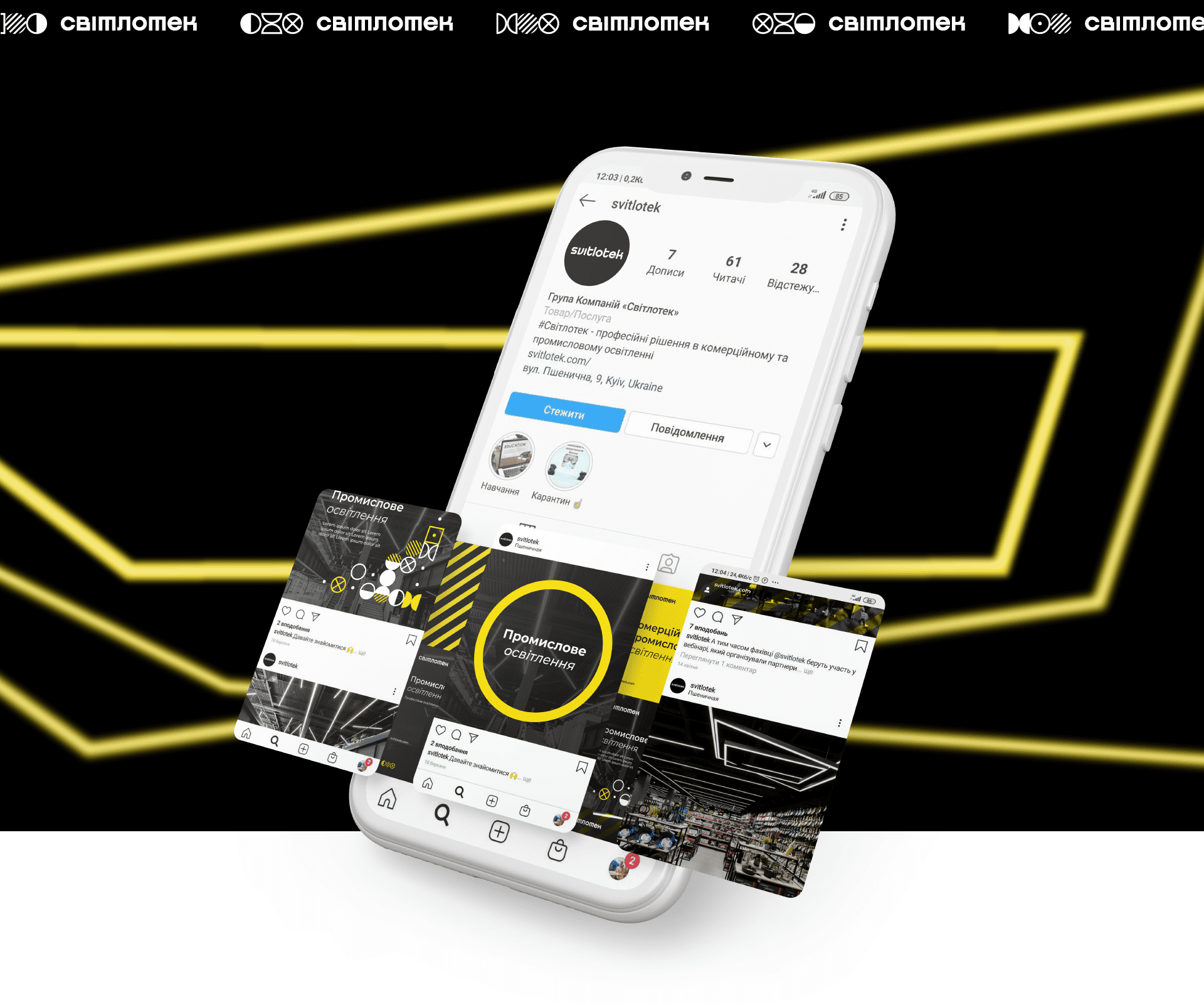

Ребрендинг Світлотек
Client: Svitlotek, a professional lighting supplier.
Task: to create a modern identity of the group of companies that would reflect the advantages of Svitlotek (flexibility, mobility, experience).
Solution: We went the way of dynamic identity. The dynamics simply and accurately conveys the main business ambition of the Svitlotek brand – bringing production to the European level, the level of world significance. The clarity of the main style-forming compositions, the purity of the lines, the symbolism at the subconscious level give confidence in the stability and transparency of the work of the Svitlotek company.
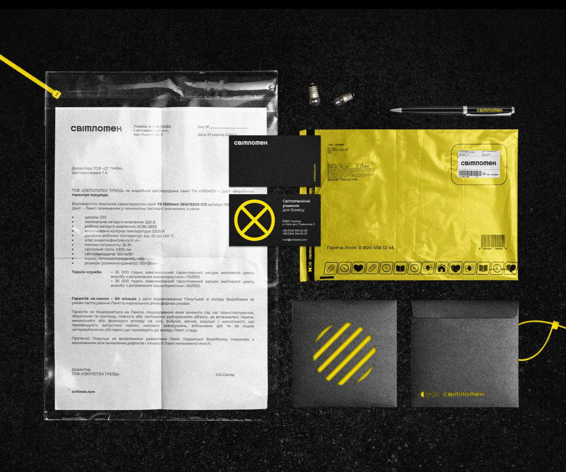
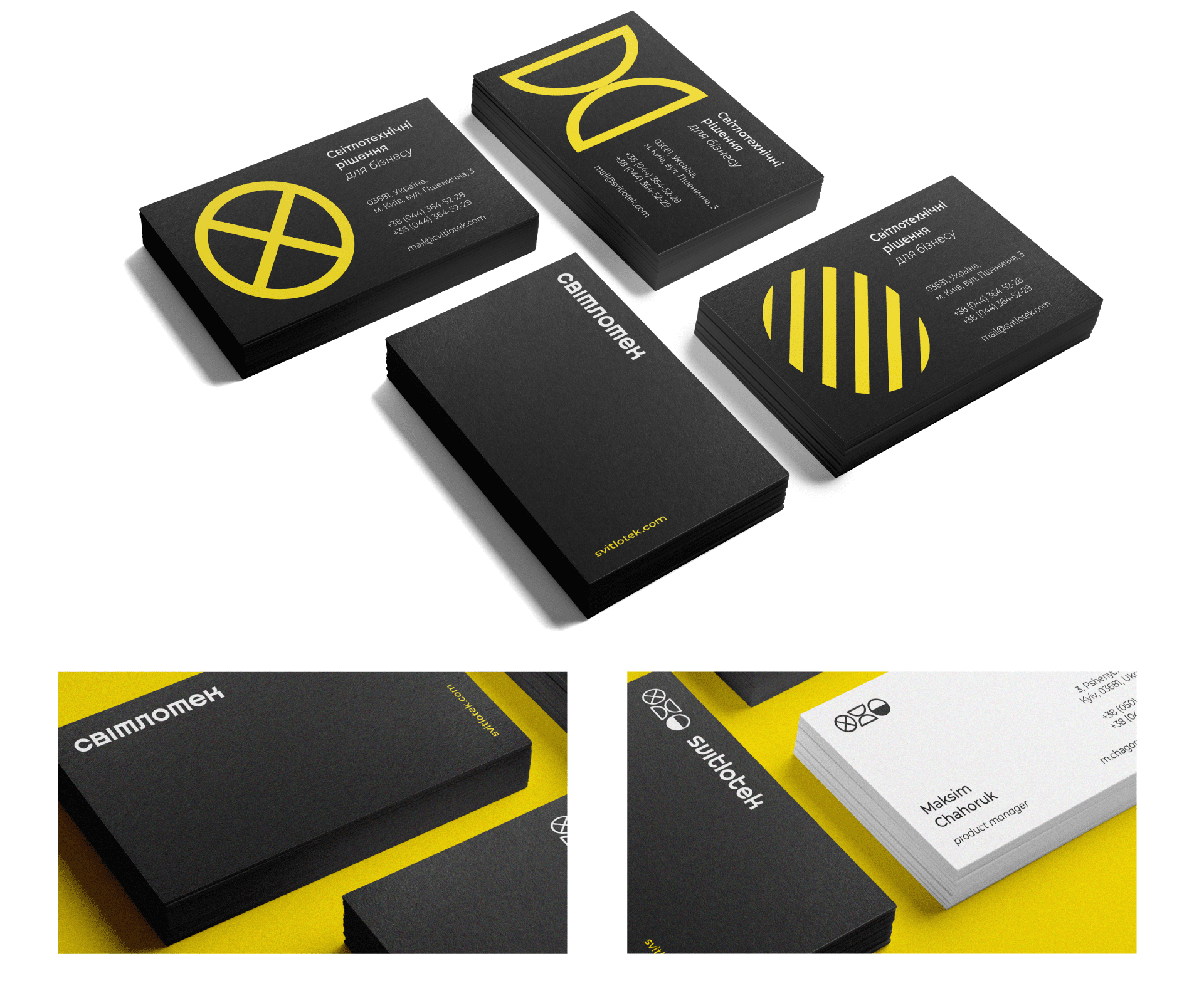
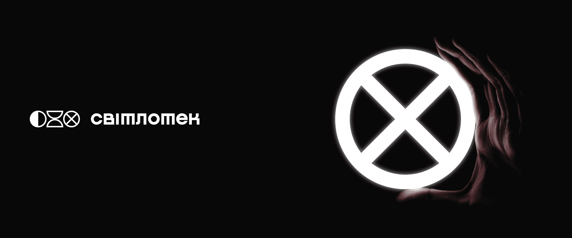
The icons of the logo group are constantly changing and lining up in simple and complex compositions. The Cyrillic logo has an interesting letter T, which makes it recognizable even without a sign. The letters O, E are as close as possible to the circle so that they work in unison with the round icons-signs. Each icon of a sign carries a technical conditional meaning.
Logo redesign
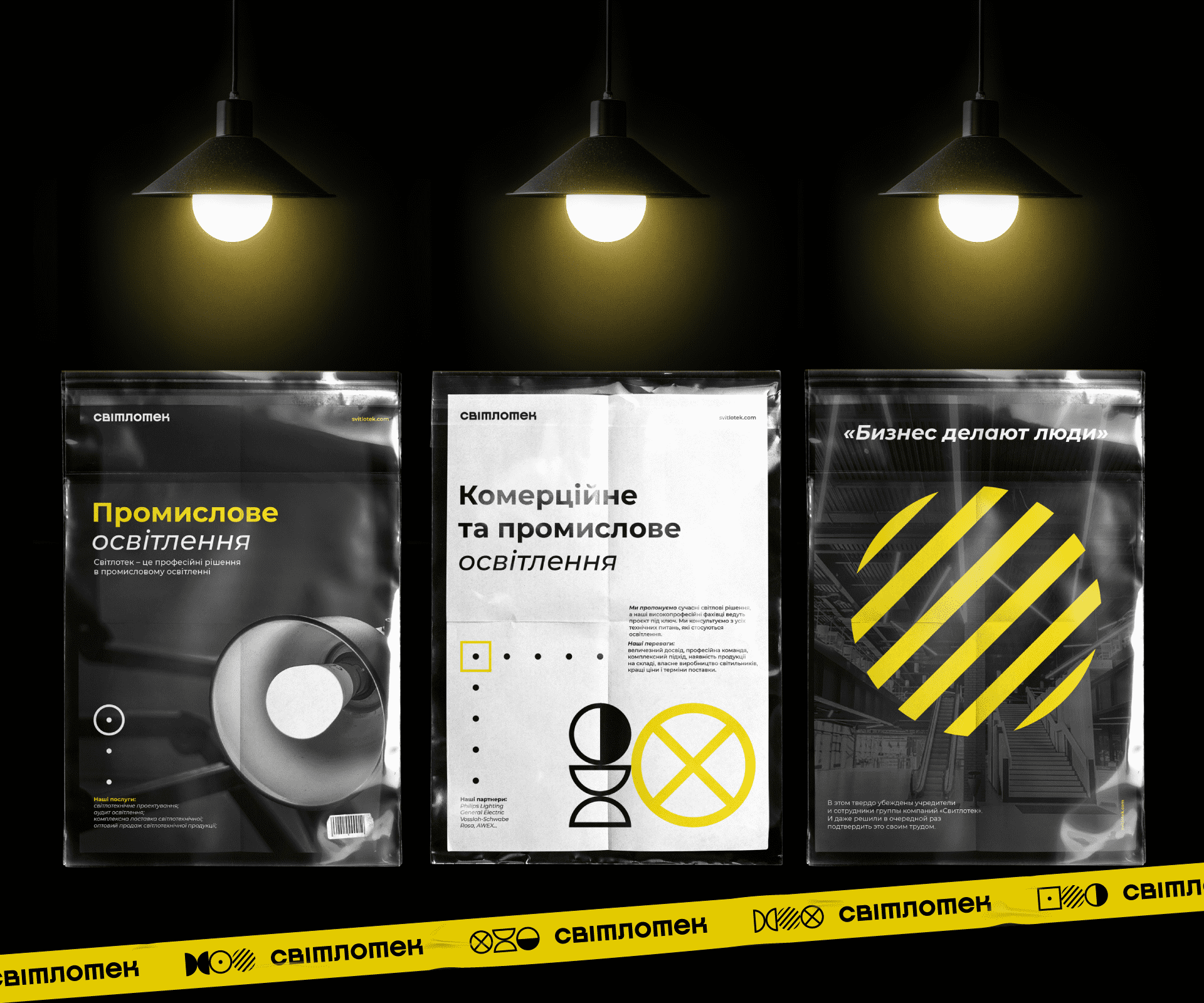
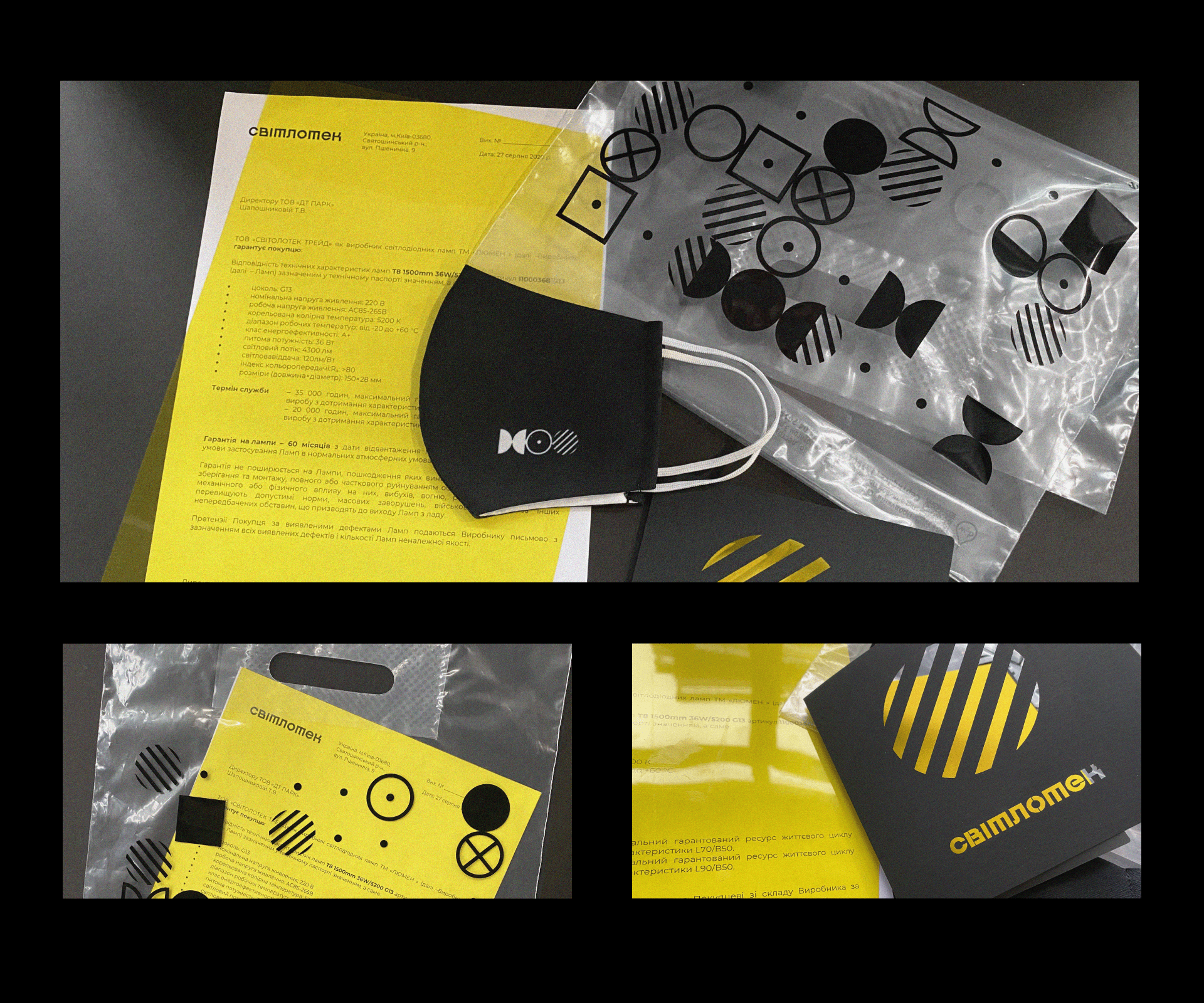
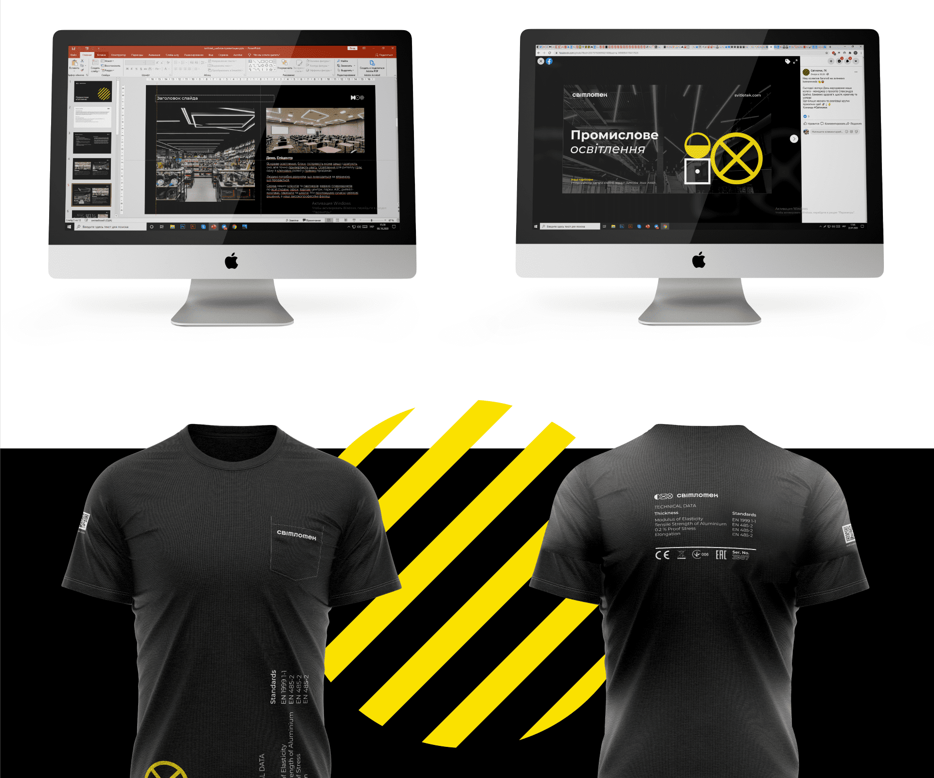
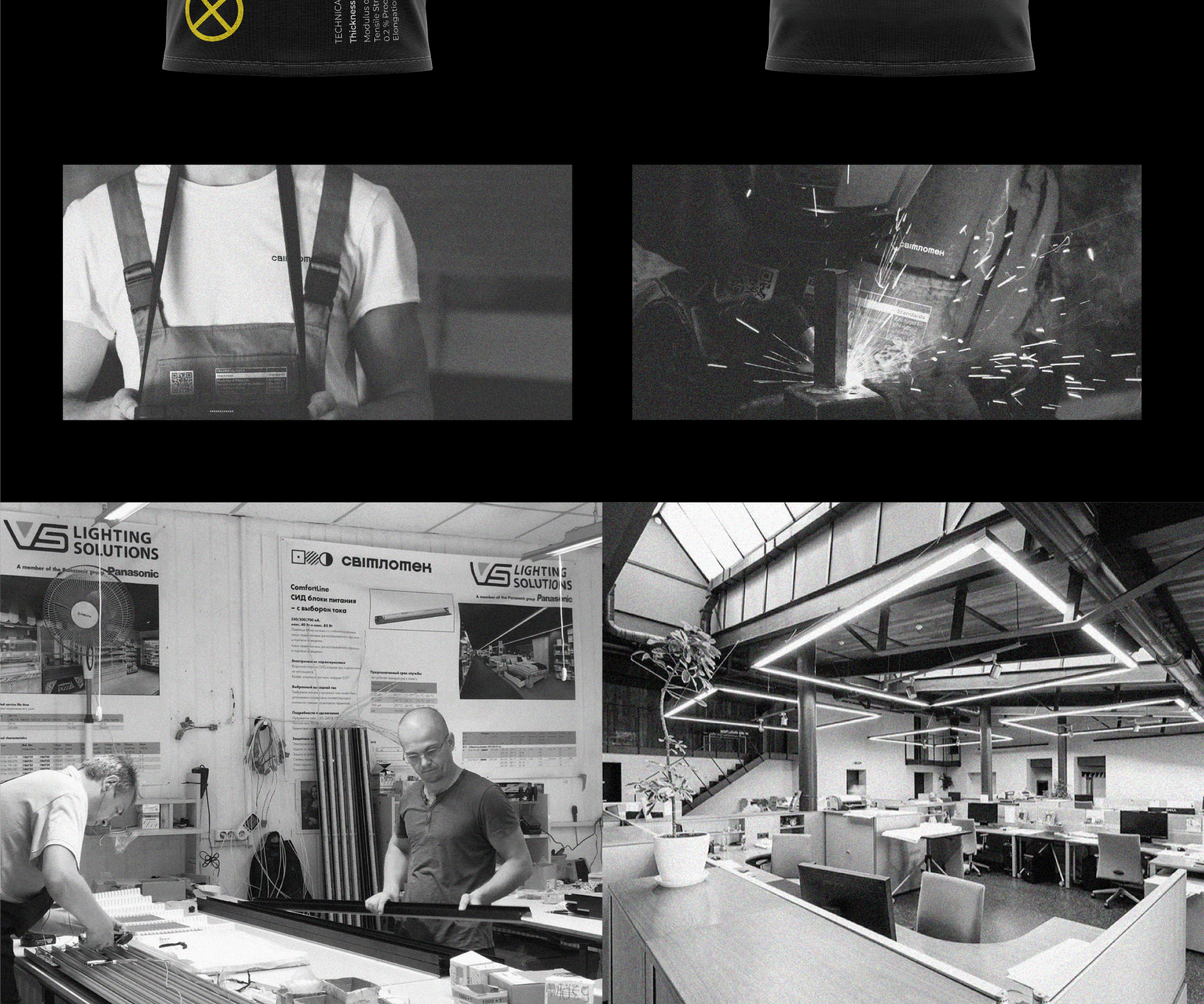
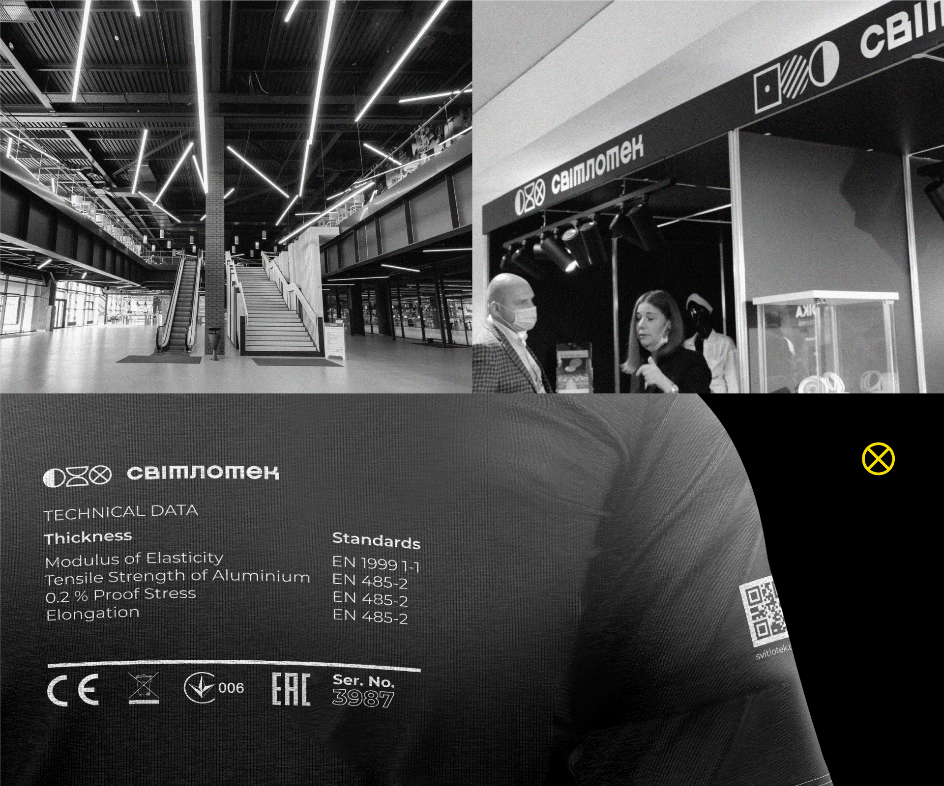
Identity
Guidebook
Project team
Наталия Закашанская
Кирилл Ткачев
Мария Омельчук
Владислав Гелетко
Александр Гребенюк