Rotex rebranding
Бренд мелкой бытовой техники
Client: Rotex is a low-price small appliance brand with the ambition to stand out from the competition from Vitek, Saturn, Elenberg and others.
Task: Rebranding, which will establish a modern image for the client.
Solution: Qualitative and quantitative research; creative-strategic working session; creating of a brand passport; development of a logo and corporate identity. The last stage took place in several approaches.
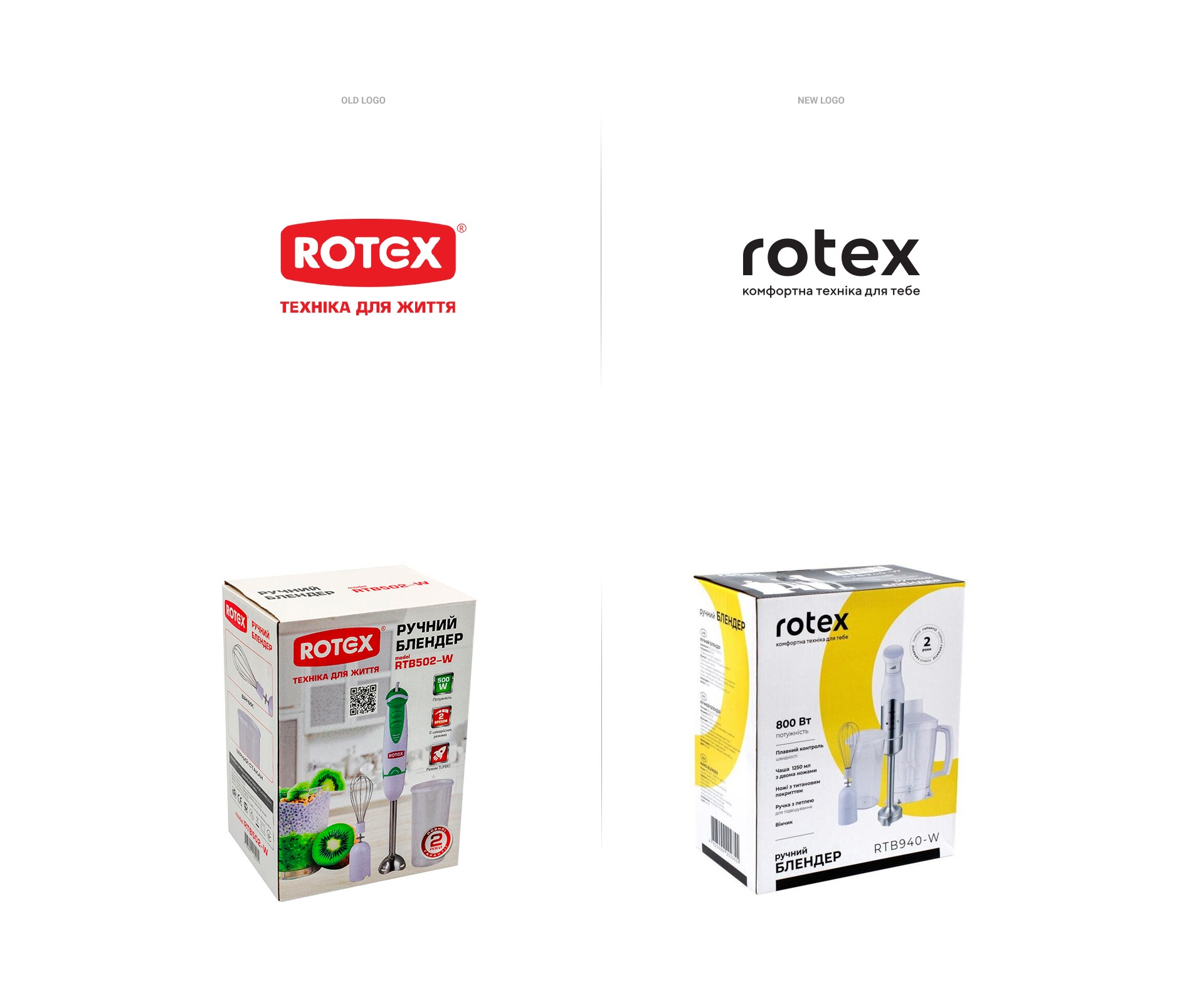
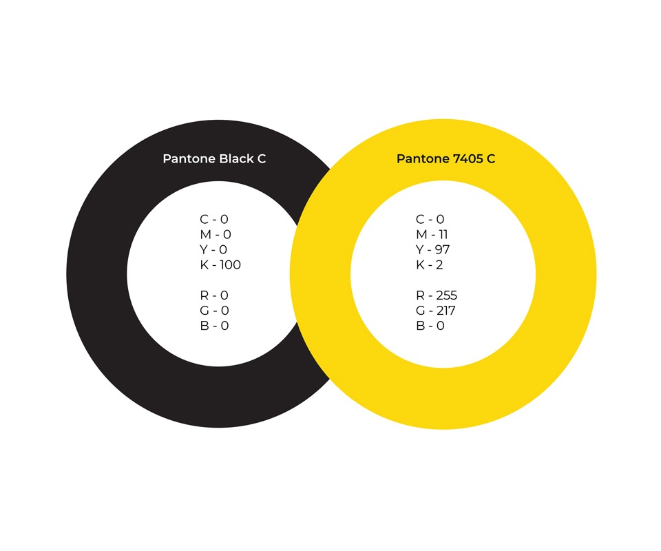
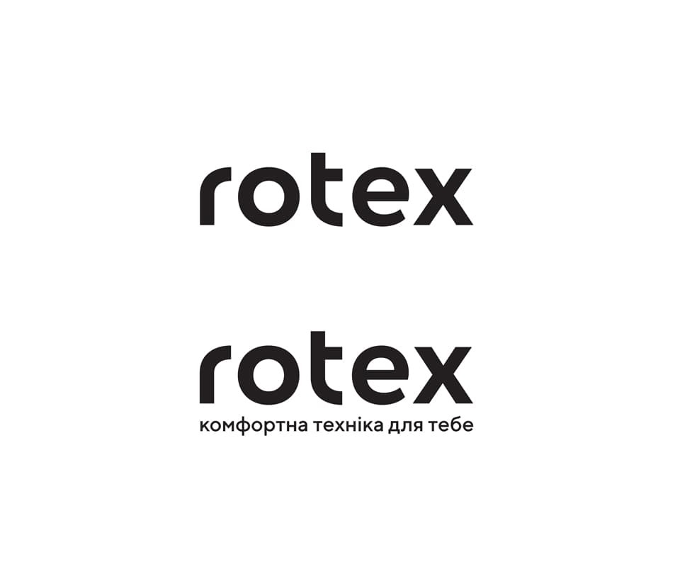
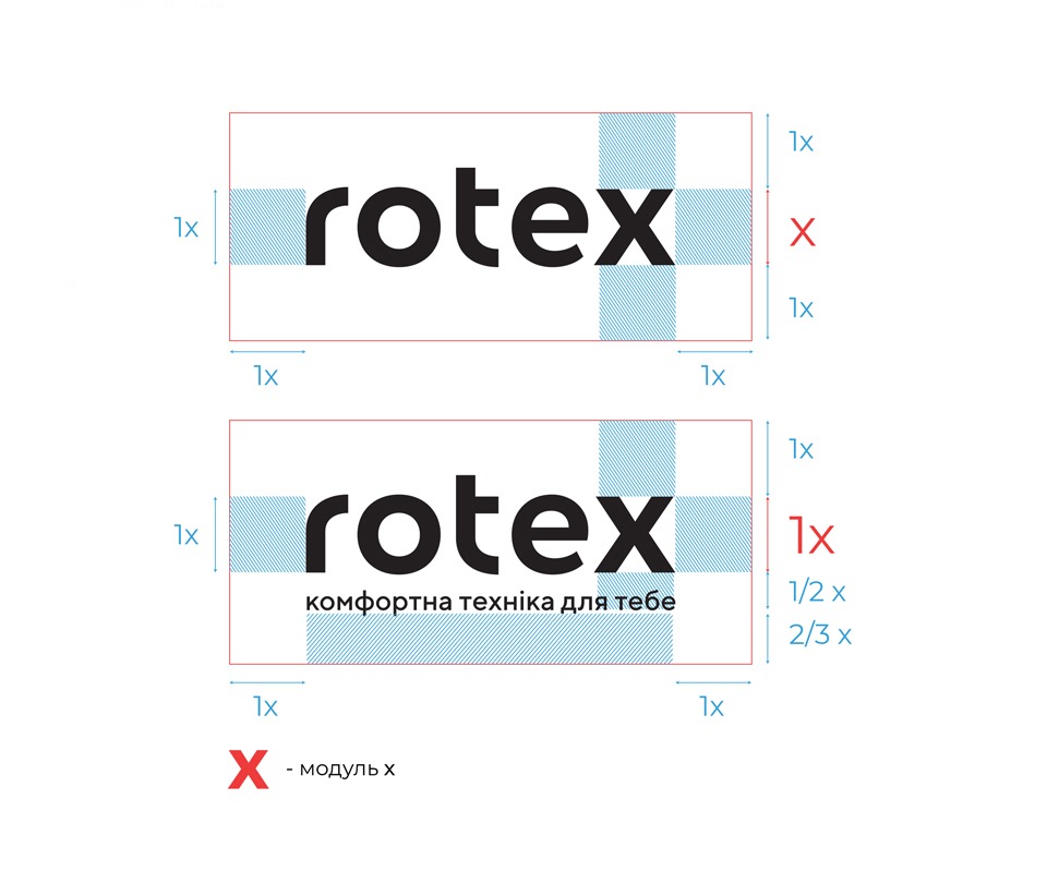
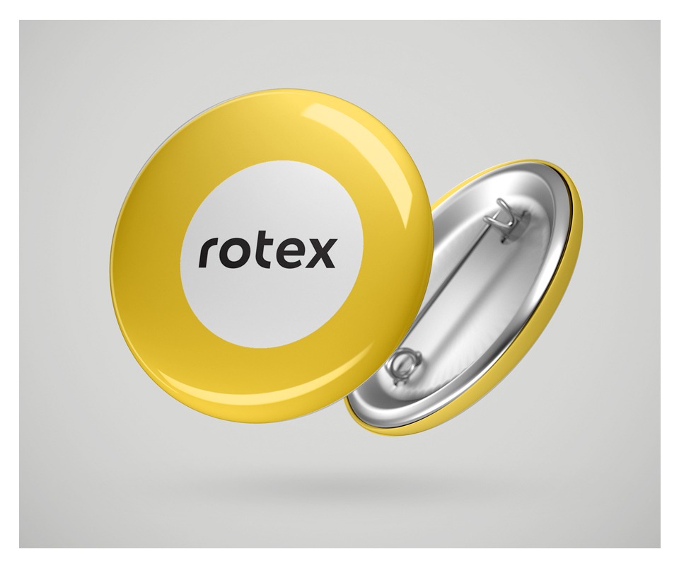
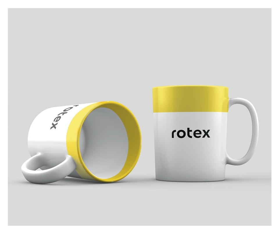
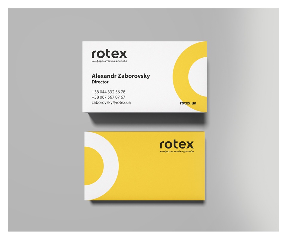
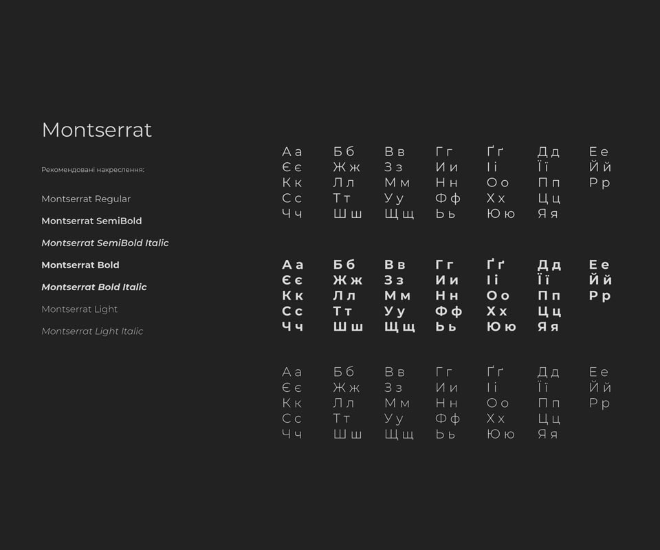
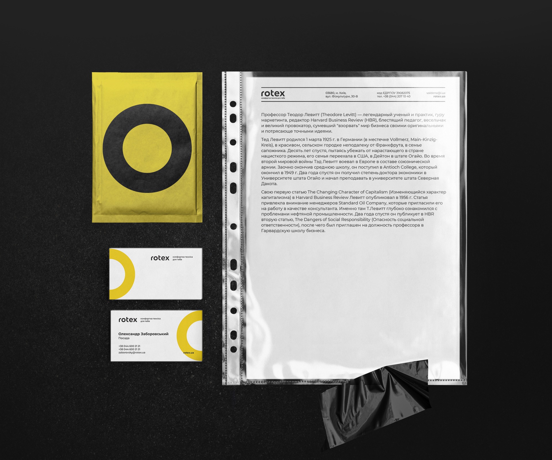
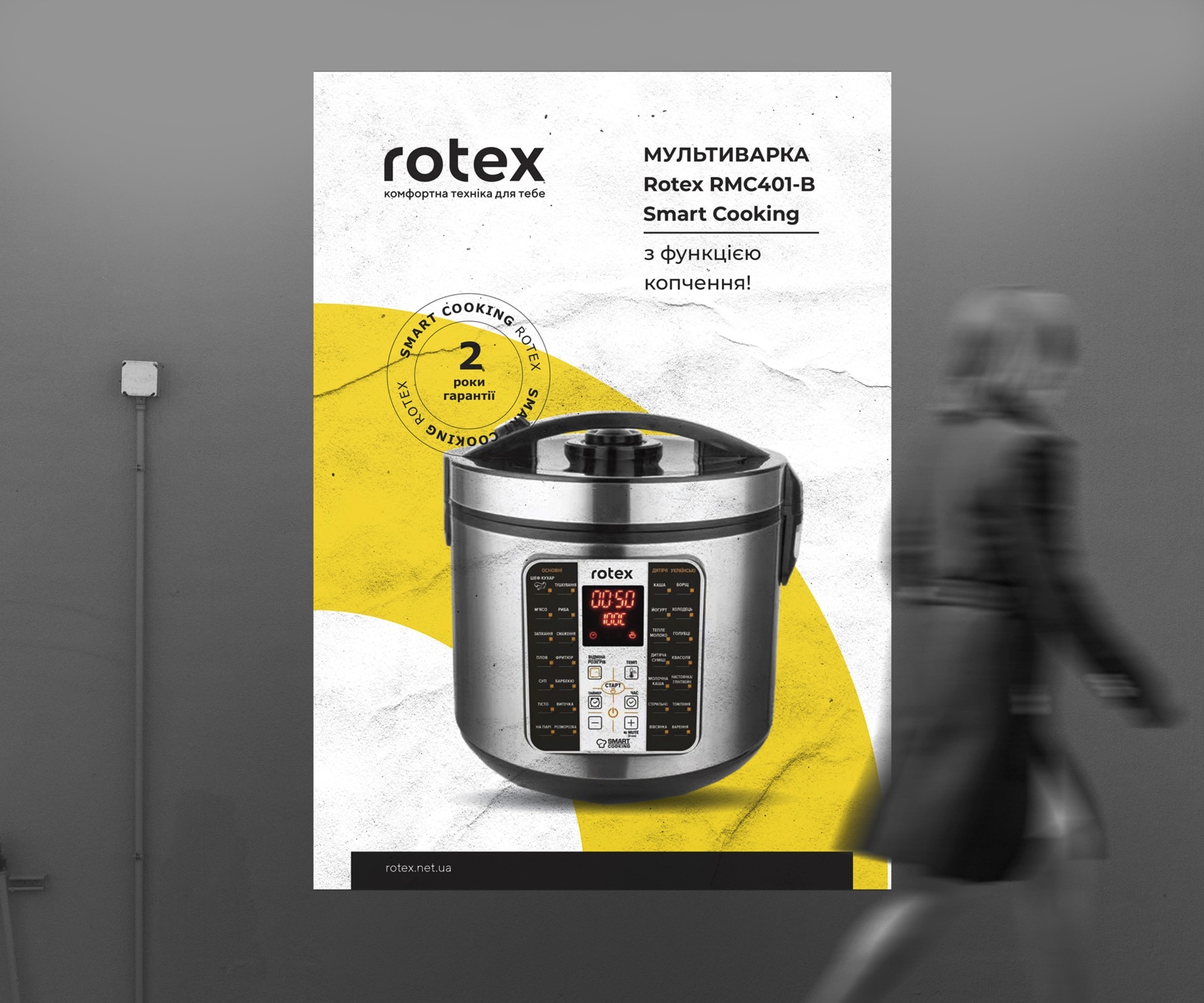
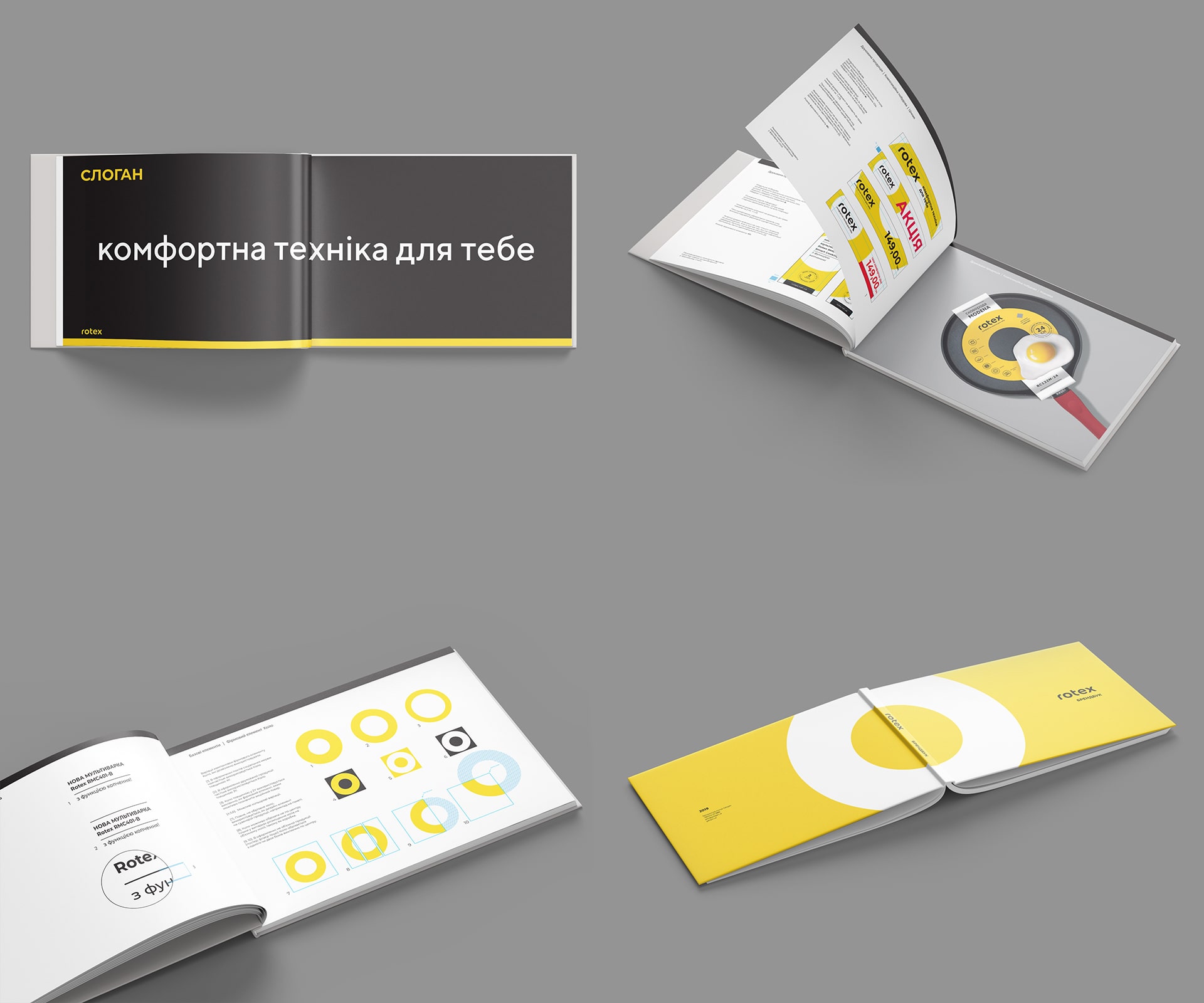
First, we researched the market, consumer experience, then we built a new brand development strategy. Next, a logo was created based on the input data. The concept of the logo is simplicity and conciseness, soft smooth corners, as associations with care and comfort. The title is lowercase to evoke a sense of affinity with the brand. The black font color is fundamental, serious, simple and neutral. It is elegant and serves the purpose of the audience – reminiscent of that it is usually used for high-end brands, but the products remain accessible to the masses. In combination with black, the logo uses a special archetype – a circle that inspires confidence and is subconsciously associated with comfort and care. The minimalism of the logo indicates a simple and understandable technique.
Positiining
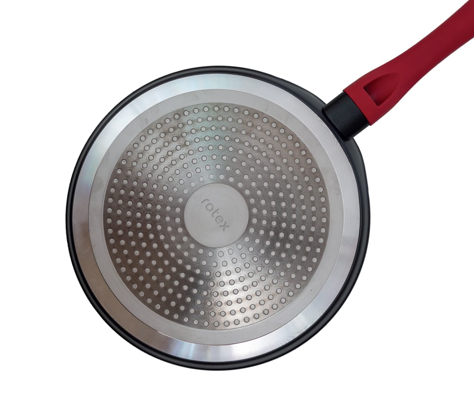
Logotype
Identity
Slogan
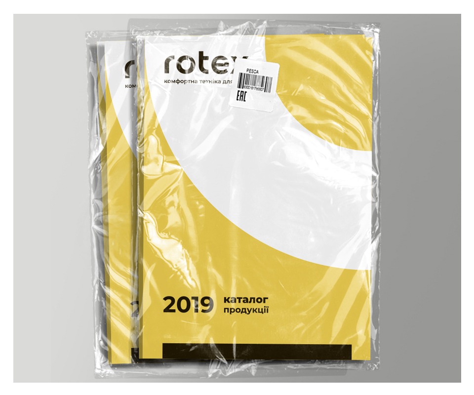
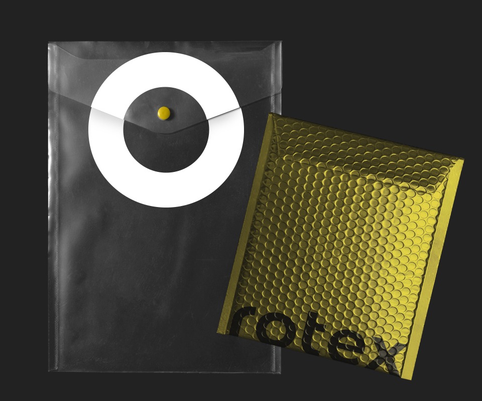
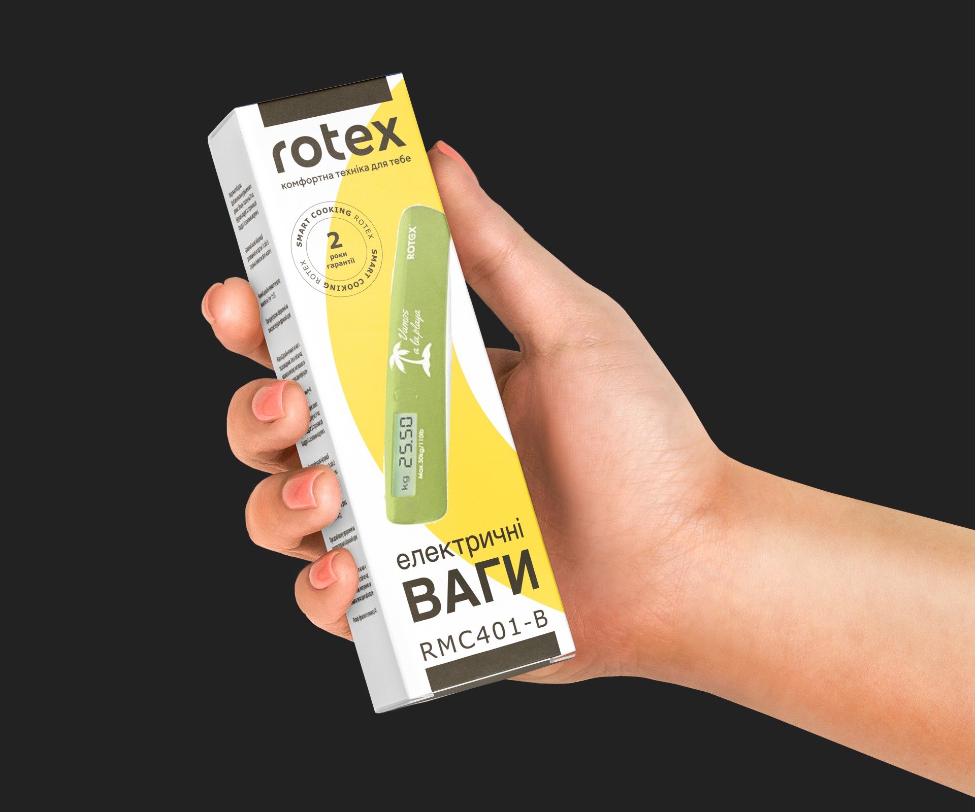
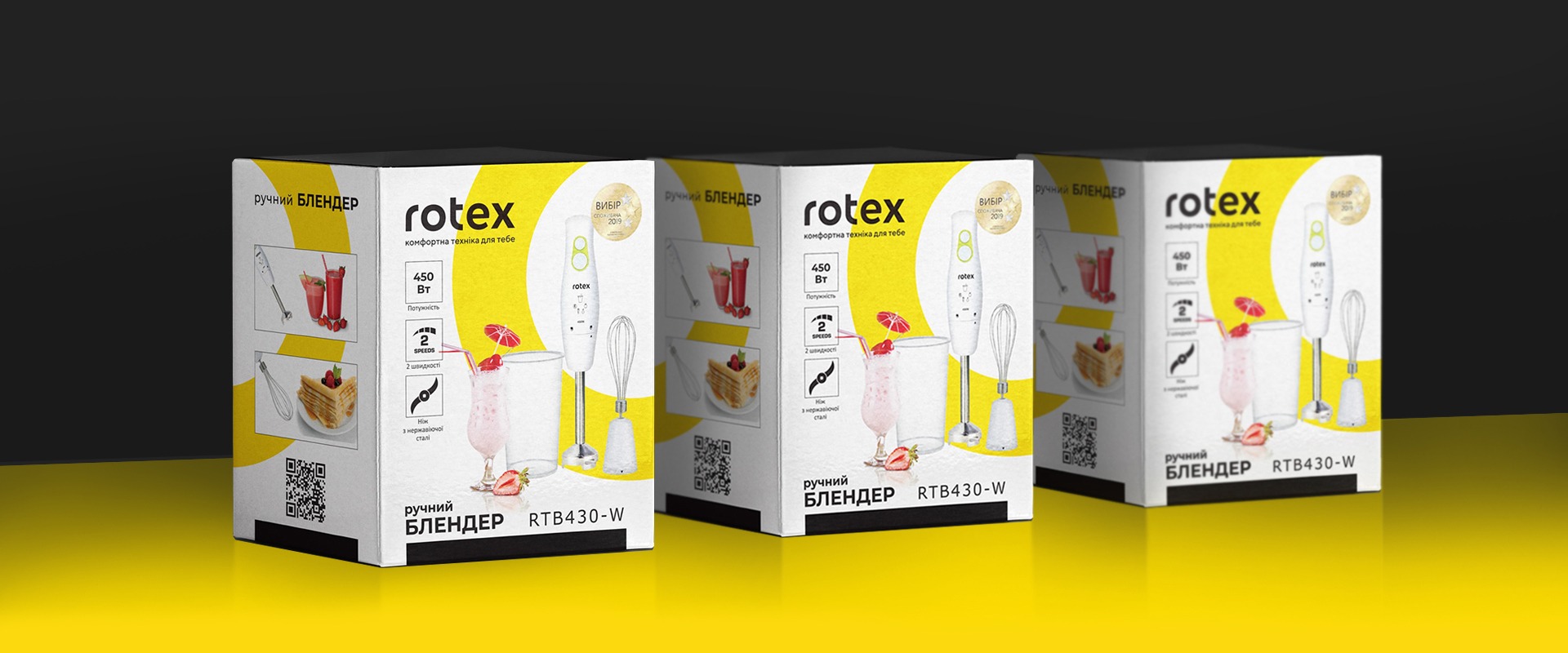
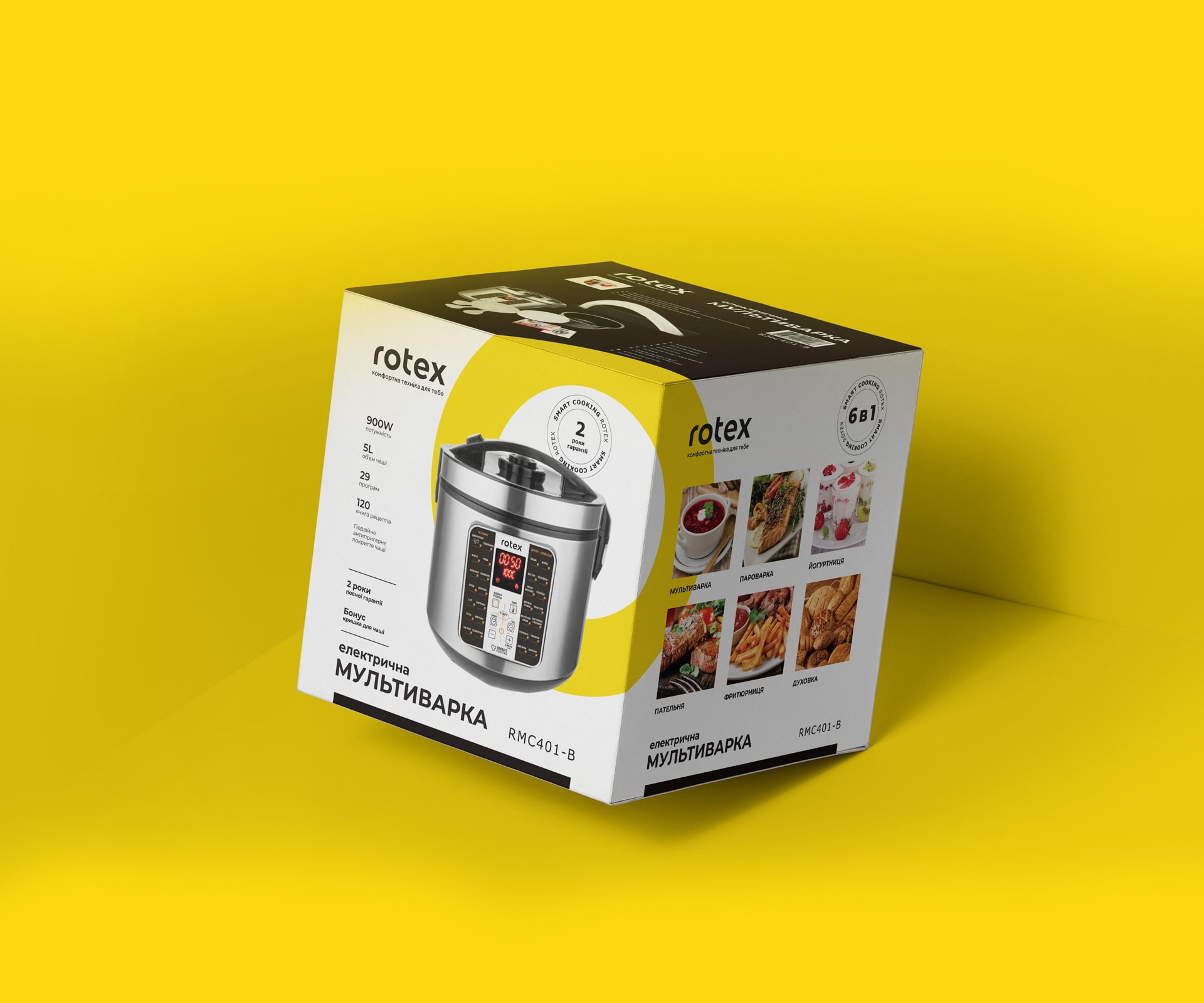
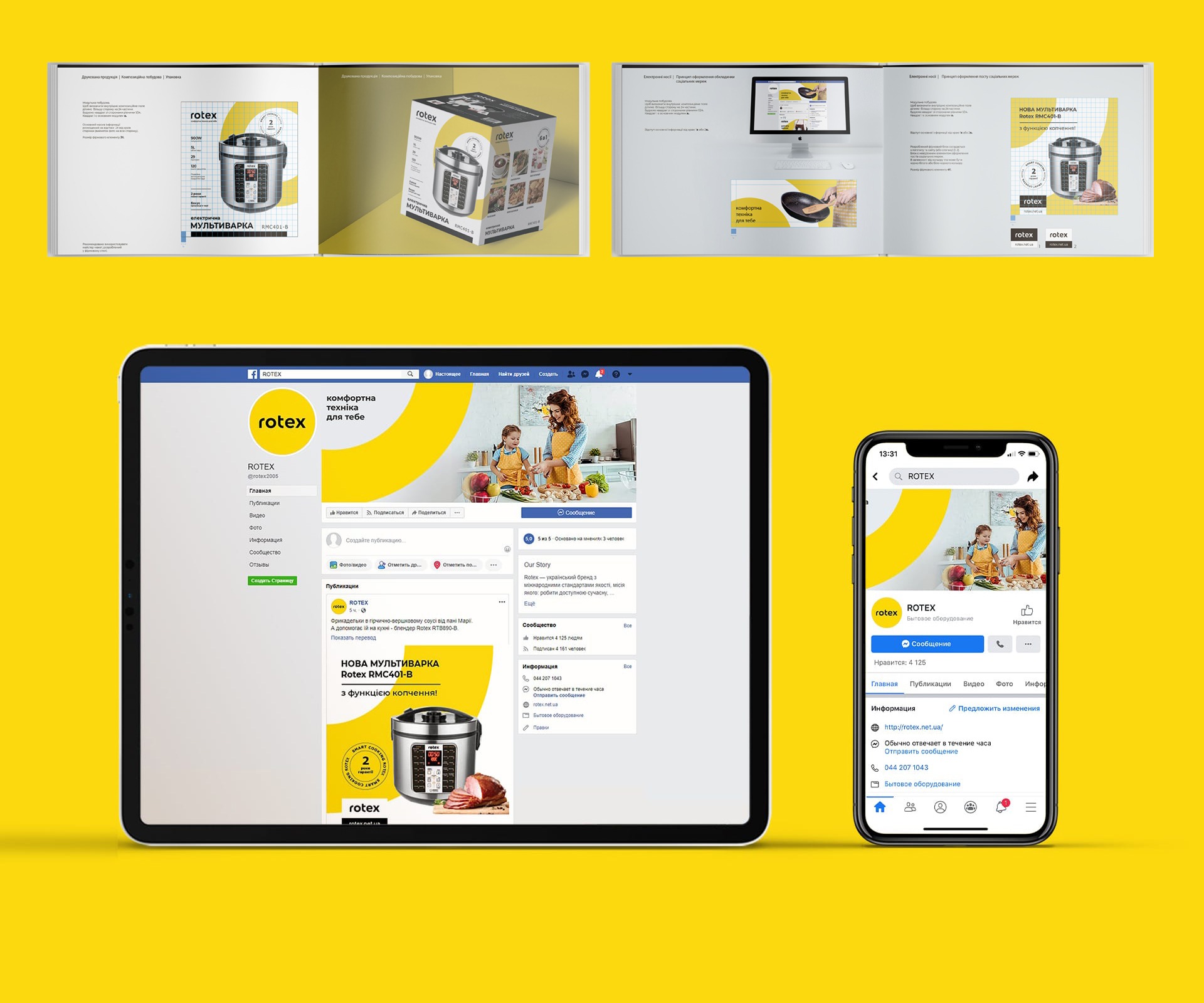
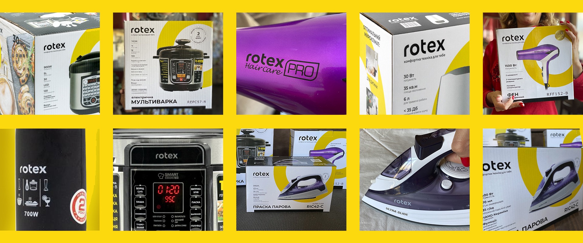
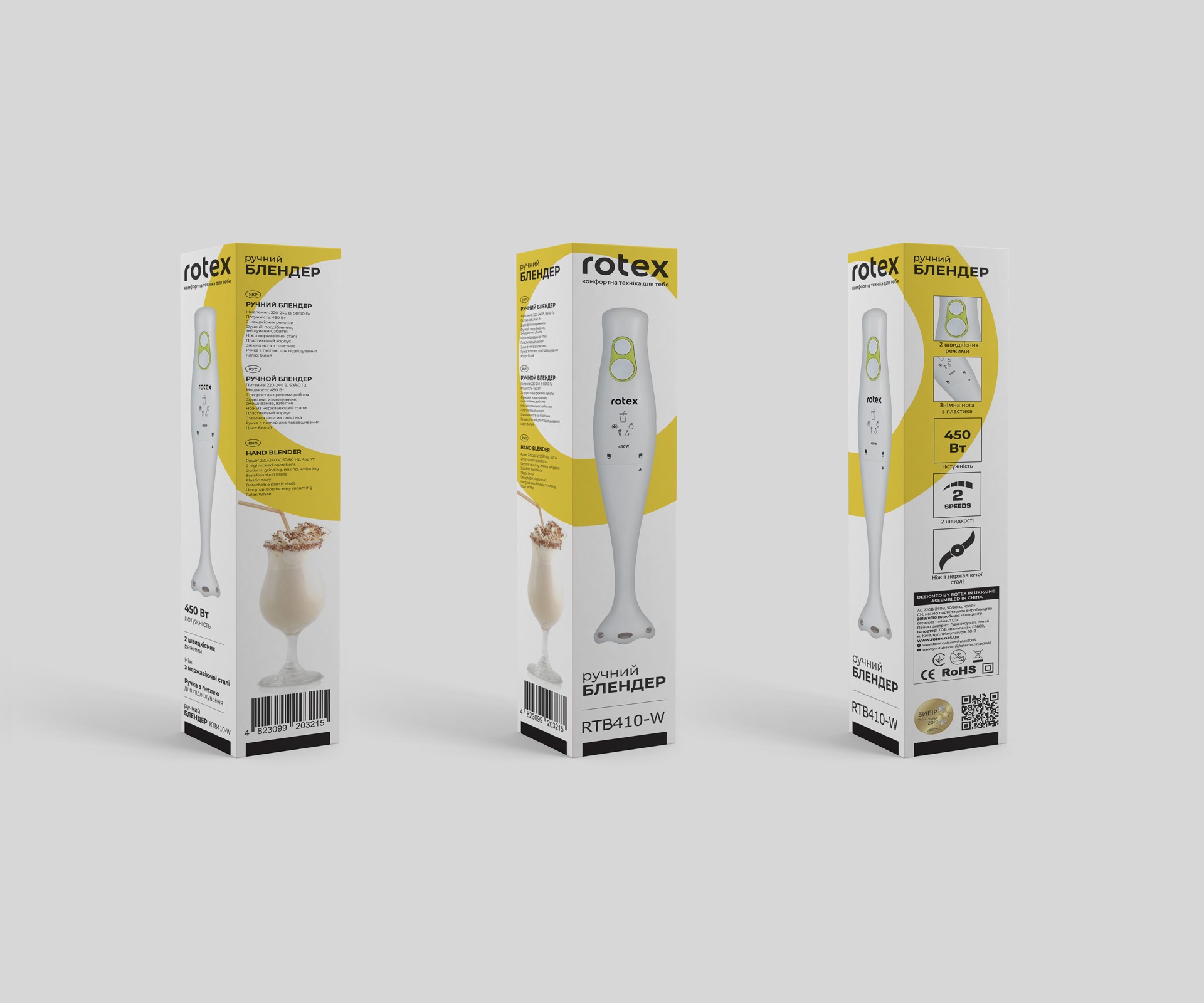
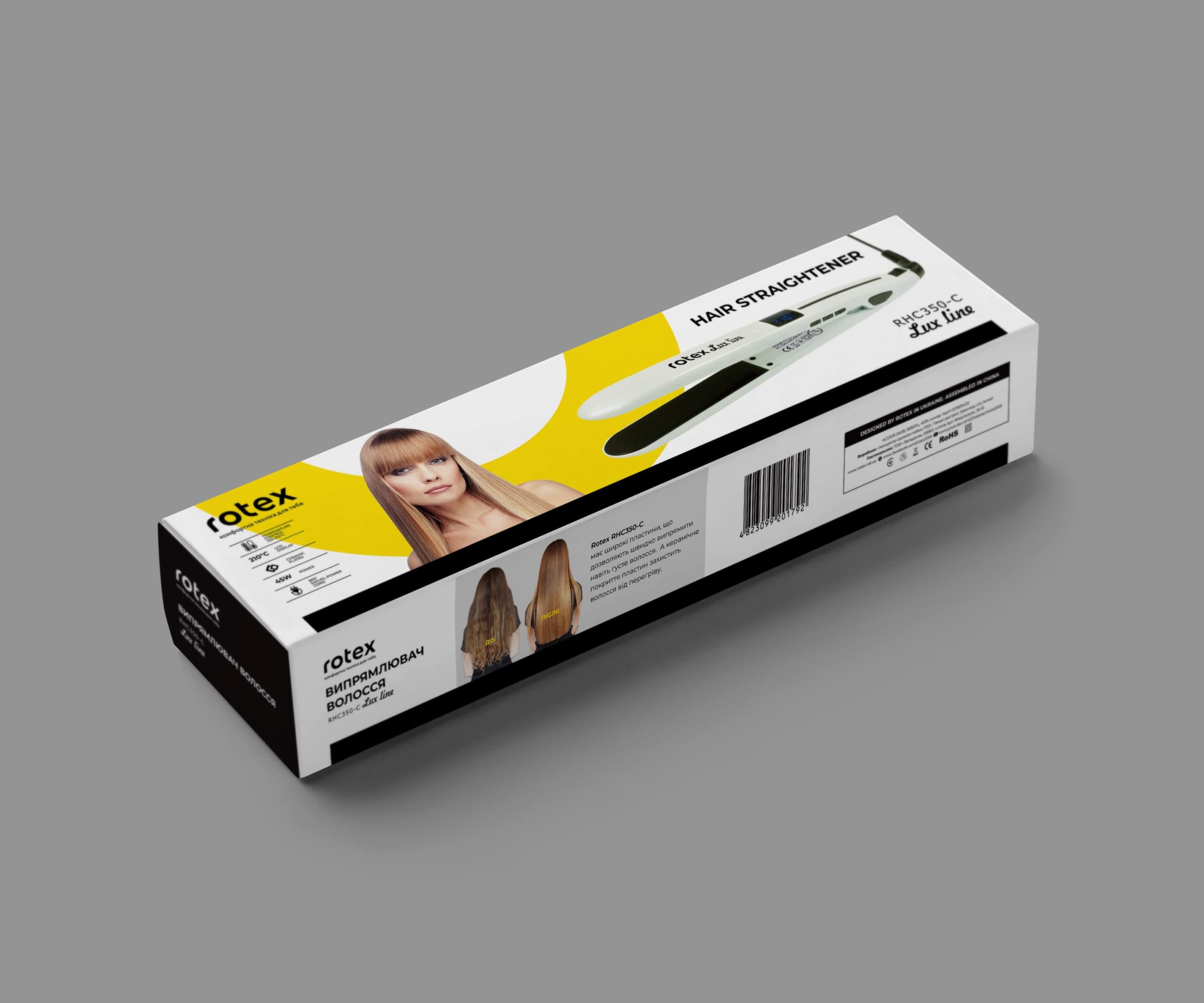
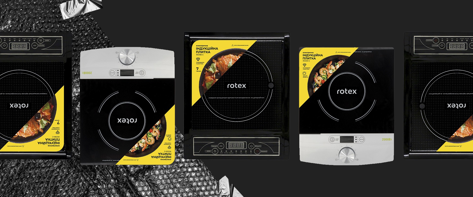
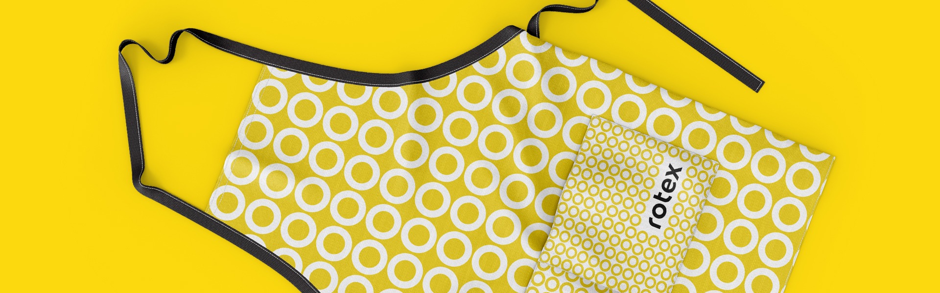
Packaging
Project team
Nataly Zakashanska
Daria Bairamova
Myhaylo Cheryak
Mariia Omelchuk